John Baskerville, the inventor of the Baskerville typeface
that we still use today, produced this beautiful Bible in 1769 (Old Testament)
and 1771 (New Testament). One rare-book site calls it “one of the most
beautiful of all English Bibles, from a typographical viewpoint.” (greatsite.com)
 |
| Title page and engraving of Adam and Eve. |
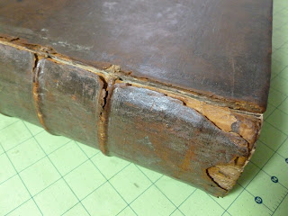 |
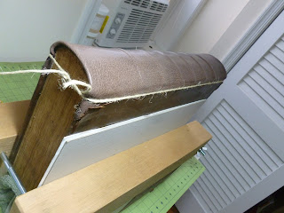
| The original spine was broken at the joints. |
 |
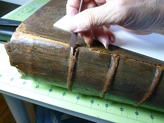
| Cleaning off the spine. |
 |
| Corner after repair with dyed Moriki. |
 |
| Corner before repair. |
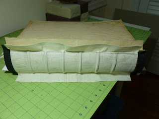 |
| Cotton flannel back liner, smoothed over the original cords. |
 |
| Starting to remove the spine after several applications of Cellugel to stabilize the leather. |
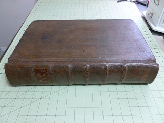 |
| Out of order, but here is the finished work. The original spine is applied over the new, color-matched leather. |
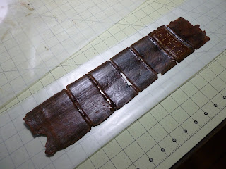 |
| The spine came off in one piece. |
 |
| Tying up the spine, before dyeing the leather. |
 |
| I tried several combinations of dyes to get the right color. |
 |
| The uneven tone was just right for the antique cover repair. Moriki is easy to work with. |
The current owner wanted to bequeath it to his son to use for
personal Bible-reading and family devotions. It was, of course, a tight back (the
spine adhered directly to the signatures). I told him that I had seen another
copy of this book priced at $5000 in a recent catalog, rebound by Sangorski
& Sutcliffe. When I explained that changing the structure to a hollow back
would make it stronger and more usable, but would reduce the value of the book,
he simply said he didn’t care about the monetary value—he wanted his son to be
able to use the Bible.
So, taking a deep breath, I removed the spine—all in one
piece!—after repeated applications of Cellugel to stabilize the brittle
leather. I felt deep respect for the printers and binders who had produced such
a high quality work. In my imagination, the book seemed to respond happily to
the treatment. The owner and his son were happy with the work. This was one of my favorite projects.


Tawn, where are you located?
ReplyDelete